All bettors want to make bets that give them a positive edge, but what does an edge look like? In his Betting Resources’ debut our Head of Analytics answers this enduring question with a unique approach: visualisation of value. Continue reading for some unique insight into what a betting edge looks like.
Most regular readers of Betting Resources should be well aware of the concept of betting margins and how they relate to long-term profit. So rather than covering old ground explaining how much of an edge you need to beat a bookmaker regularly I would like to approach the subject from an entirely different angle – by showing you what an edge looks like in a literal sense.
Any discussion about betting is framed by the odds. Maybe you’ve placed a wager in decimal odds of 1.95, or US odds of -125 before. The odds themselves are simply a reflection of the underlying probability of the event – how likely is it to happen? If you place a bet at 4.00 your assessment is that the event in question will actually happen more often than just 1 out of 4 times, so more often than 25% of the time – the bet therefore represents good value to you.
We also know that every bet has to have a chance of winning somewhere between 0% (never gonna happen) and 100% (absolute certainty). To motivate the following graphs and explanations, I would like to ask some questions to all readers:
A. Which of these two wagers provides the highest expected return of investment? (i.e if you place one unit on each of those two wagers, which would provide the greater expected return?)
- The offered line is 5.00 and you think you have a 2.5% edge when placing a bet. (So the offered probability is 20%, and you think you will win this bet 22.5% of the time).
- The offered line is 1.25 and you think you have a 10% edge when placing a bet here. (So the offered probability is 80%, and you think you will win this bet 90% of the time).
B. Which of these two wagers offers the highest expected return of investment?
- The offered line is 4.00 but the actual fair line without any margin should be 5.00. (So the offered probability is 25%, but it will only happen 20% of the time).
- The offered line is 1.25 but the actual fair line without any margin should be 1.333. (So the offered probability is 80%, but it would only happen 75% of the time).
We will return to these teasers at the end of this article but in order to arrive at the answers, I want to start by visualising what a bet (and associated margin) looks like.
Visualising a line
Regardless of what odds format we are using to place wagers it all comes down to probabilities in the end. Every bet has a corresponding likelihood of it happening, so it can be represented as a probability.
In order to be profitable bookmakers do not offer odds that fairly represent that true probability. They charge a little extra - a margin - that protects them from the uncertainty associated with predicting future events.
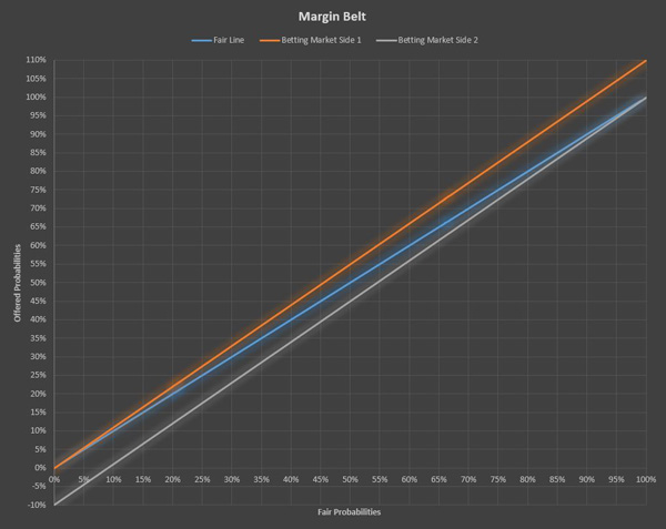
This can be graphically represented using a Margin Belt:
- We have a fair line where the odds are equal on both sides.
- In addition there are two lines that represent how betting might be offered with a margin on each side.
By just looking at this graph it does not become clear immediately what it means, so let’s add some annotations.
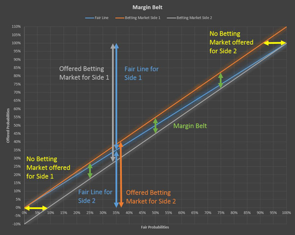
This is an example where we assume the bookmaker will charge a 10% total margin and apply it proportionally on both sides of the fair line.
We can see some probabilities in the lines with margin where we cross the 0% or 100% boundaries. Those cases occur when a bet is so likely to occur that it cannot be offered after adding the safety margin using this method.
In addition we can see that the two lines with margin are always parallel – the same distance apart – this is what we refer to as the Margin Belt.
What really matters here is not how much margin is charged, but how it compares proportionally to the bet one was placing.
It makes easier to understand what the Margin Belt represents by thinking that the bookmaker makes money whenever a result ends up within this Margin Belt – when the probability of the event is within that range - and does not make money when it is outside of it. This is a simplification of course but allows us to give meaning to the graphs.
Additionally, by looking at this Margin Belt you might think that wagers placed on big favourites - so odds less than 1.500 - are more expensive for the bettor, as more of the margin is applied to the bettors’ chosen side. But what really matters here is not how much margin is charged, but how it compares proportionally to the bet one was placing. Going forward we will use bars to represent this key measure.
We could of course solve the return on investment, by calculating through the odds and likelihoods, but as the point of the article is to show you what an edge looks like, I am sticking to charts only as these should hopefully be easier to digest than the maths.
So having introduced the concept of the Margin Belt, and our visual measure of the value of the bet using bars, lets return to our questions.
-
- A. In both of the cases we can see that we should make a profit, but how much profit? Which of the two is the better in terms of investing money?
-
- The offered line is 5.00 and you think you have a 2.5% edge when placing a bet here. (So the offered probability is 20%, and you think you will win this bet 22.5% of the time).
-
- The offered line is 1.25 and you think you have a 10% edge when placing a bet here. (So the offered probability is 80%, and you think you will win this bet 90% of the time).
-
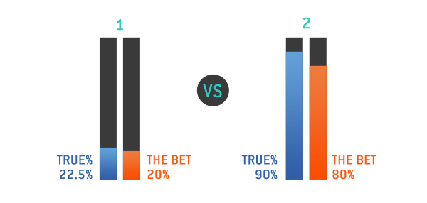
What really matters here is not the numbers but the length of the bars. What defines our estimated return on investment is the ratio of the bars. In the first example the edge was 2.5%, which is the difference of the bars, so the difference fits in the bet probability 8 times – 20 divided by 2.5.

Therefore your expected return is 1+ 1/8, so 112.5%. So for every unit you wager on this line, you expect to win 0.125 units.
On the second example we will see a very similar pattern:

We have the exact same ratio, and therefore we have the same expected payout of 0.125 units for each unit wagered.
So the answer to the original question – which bet offers the higher expected return? The answer is that they have an identical expected return.
For the second example we have different lines, on which your expected payout is negative.
-
- A. On which of these two wagers would you have the highest expected return of investment?
-
- The offered line is 4.00 but the actual fair line without any margin would be 5.00. (So the offered probability is 25%, but it will only happen 20% of the time).
-
- The offered line is 1.25 but the actual fair line without any margin would be 1.50. (So the offered probability is 80%, but it would only happen 66.67% of the time).
-
Here we could apply the diagrams from above to see the lengths of the bars for fair vs. margin lines.
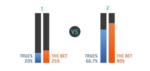
Here we have two ways to do a similar exercise to what we did earlier:
-
-
- We do the same as before and check how often the difference fits into the bet placed. But in this case, as the results are negative we have to add a (–) in front of the results. This means bet one has a negative expected return on investment.
-
Therefore the 1st bet has a return on investment of 1 unit minus 20%, which is the same as saying you get 80%, so 4/5 back, where the 2nd bet has a return on investment of 1 unit minus 16.67%, which returns 83.33%, so 5/6.
-
-
- The other way to take a look at it is to create a betting market overview and read out the expected ROI from the betting market graph:
-
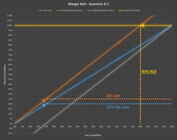
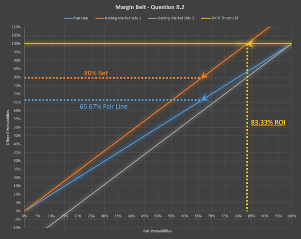
What we can do here is to read the return on investment from the graph by looking at the intersection between the 100% offered probability line and the betting market. This will define the ROI on every wager placed on this combination of fair odds and the betting market offered corresponding to it.
So in the second example the wager with the better ROI was wager 2.
The intent of all content within Betting Resources is to try and explain how betting works, but the way in which people learn is, of course, not uniform. Some people find it easier to absorb information when presented visually, which is what motivated me to take a common theme from several previous articles – defining what an edge is - and present it in a very different way.
By literally showing what an edge in betting actually looks – via a Margin Belt – I hope that a few more bettors will adapt their thinking and also appreciate the value of the low-margin approach to betting that Pinnacle takes.
MORE: TOP 100 Online Bookmakers >>>
MORE: TOP 20 Bookmakers that accept U.S. players >>>
MORE: TOP 20 Bookmakers that accept Cryptocurrency >>>
Source: pinnacle.com
